List
Demonstrates the List widget.
git clone https://github.com/ratatui/ratatui.git --branch latestcd ratatuicargo run --example=list --features=crossterm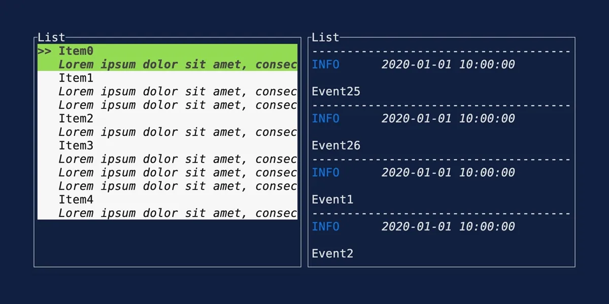
//! # [Ratatui] List example//!//! The latest version of this example is available in the [examples] folder in the repository.//!//! Please note that the examples are designed to be run against the `main` branch of the Github//! repository. This means that you may not be able to compile with the latest release version on//! crates.io, or the one that you have installed locally.//!//! See the [examples readme] for more information on finding examples that match the version of the//! library you are using.//!//! [Ratatui]: https://github.com/ratatui/ratatui//! [examples]: https://github.com/ratatui/ratatui/blob/main/examples//! [examples readme]: https://github.com/ratatui/ratatui/blob/main/examples/README.md
use color_eyre::Result;use ratatui::{    buffer::Buffer,    crossterm::event::{self, Event, KeyCode, KeyEvent, KeyEventKind},    layout::{Constraint, Layout, Rect},    style::{        palette::tailwind::{BLUE, GREEN, SLATE},        Color, Modifier, Style, Stylize,    },    symbols,    text::Line,    widgets::{        Block, Borders, HighlightSpacing, List, ListItem, ListState, Padding, Paragraph,        StatefulWidget, Widget, Wrap,    },    DefaultTerminal,};
const TODO_HEADER_STYLE: Style = Style::new().fg(SLATE.c100).bg(BLUE.c800);const NORMAL_ROW_BG: Color = SLATE.c950;const ALT_ROW_BG_COLOR: Color = SLATE.c900;const SELECTED_STYLE: Style = Style::new().bg(SLATE.c800).add_modifier(Modifier::BOLD);const TEXT_FG_COLOR: Color = SLATE.c200;const COMPLETED_TEXT_FG_COLOR: Color = GREEN.c500;
fn main() -> Result<()> {    color_eyre::install()?;    let terminal = ratatui::init();    let app_result = App::default().run(terminal);    ratatui::restore();    app_result}
/// This struct holds the current state of the app. In particular, it has the `todo_list` field/// which is a wrapper around `ListState`. Keeping track of the state lets us render the/// associated widget with its state and have access to features such as natural scrolling.////// Check the event handling at the bottom to see how to change the state on incoming events. Check/// the drawing logic for items on how to specify the highlighting style for selected items.struct App {    should_exit: bool,    todo_list: TodoList,}
struct TodoList {    items: Vec<TodoItem>,    state: ListState,}
#[derive(Debug)]struct TodoItem {    todo: String,    info: String,    status: Status,}
#[derive(Debug, Clone, Copy, PartialEq, Eq, PartialOrd, Ord, Hash)]enum Status {    Todo,    Completed,}
impl Default for App {    fn default() -> Self {        Self {            should_exit: false,            todo_list: TodoList::from_iter([                (Status::Todo, "Rewrite everything with Rust!", "I can't hold my inner voice. He tells me to rewrite the complete universe with Rust"),                (Status::Completed, "Rewrite all of your tui apps with Ratatui", "Yes, you heard that right. Go and replace your tui with Ratatui."),                (Status::Todo, "Pet your cat", "Minnak loves to be pet by you! Don't forget to pet and give some treats!"),                (Status::Todo, "Walk with your dog", "Max is bored, go walk with him!"),                (Status::Completed, "Pay the bills", "Pay the train subscription!!!"),                (Status::Completed, "Refactor list example", "If you see this info that means I completed this task!"),            ]),        }    }}
impl FromIterator<(Status, &'static str, &'static str)> for TodoList {    fn from_iter<I: IntoIterator<Item = (Status, &'static str, &'static str)>>(iter: I) -> Self {        let items = iter            .into_iter()            .map(|(status, todo, info)| TodoItem::new(status, todo, info))            .collect();        let state = ListState::default();        Self { items, state }    }}
impl TodoItem {    fn new(status: Status, todo: &str, info: &str) -> Self {        Self {            status,            todo: todo.to_string(),            info: info.to_string(),        }    }}
impl App {    fn run(mut self, mut terminal: DefaultTerminal) -> Result<()> {        while !self.should_exit {            terminal.draw(|frame| frame.render_widget(&mut self, frame.area()))?;            if let Event::Key(key) = event::read()? {                self.handle_key(key);            };        }        Ok(())    }
    fn handle_key(&mut self, key: KeyEvent) {        if key.kind != KeyEventKind::Press {            return;        }        match key.code {            KeyCode::Char('q') | KeyCode::Esc => self.should_exit = true,            KeyCode::Char('h') | KeyCode::Left => self.select_none(),            KeyCode::Char('j') | KeyCode::Down => self.select_next(),            KeyCode::Char('k') | KeyCode::Up => self.select_previous(),            KeyCode::Char('g') | KeyCode::Home => self.select_first(),            KeyCode::Char('G') | KeyCode::End => self.select_last(),            KeyCode::Char('l') | KeyCode::Right | KeyCode::Enter => {                self.toggle_status();            }            _ => {}        }    }
    fn select_none(&mut self) {        self.todo_list.state.select(None);    }
    fn select_next(&mut self) {        self.todo_list.state.select_next();    }    fn select_previous(&mut self) {        self.todo_list.state.select_previous();    }
    fn select_first(&mut self) {        self.todo_list.state.select_first();    }
    fn select_last(&mut self) {        self.todo_list.state.select_last();    }
    /// Changes the status of the selected list item    fn toggle_status(&mut self) {        if let Some(i) = self.todo_list.state.selected() {            self.todo_list.items[i].status = match self.todo_list.items[i].status {                Status::Completed => Status::Todo,                Status::Todo => Status::Completed,            }        }    }}
impl Widget for &mut App {    fn render(self, area: Rect, buf: &mut Buffer) {        let [header_area, main_area, footer_area] = Layout::vertical([            Constraint::Length(2),            Constraint::Fill(1),            Constraint::Length(1),        ])        .areas(area);
        let [list_area, item_area] =            Layout::vertical([Constraint::Fill(1), Constraint::Fill(1)]).areas(main_area);
        App::render_header(header_area, buf);        App::render_footer(footer_area, buf);        self.render_list(list_area, buf);        self.render_selected_item(item_area, buf);    }}
/// Rendering logic for the appimpl App {    fn render_header(area: Rect, buf: &mut Buffer) {        Paragraph::new("Ratatui List Example")            .bold()            .centered()            .render(area, buf);    }
    fn render_footer(area: Rect, buf: &mut Buffer) {        Paragraph::new("Use ↓↑ to move, ← to unselect, → to change status, g/G to go top/bottom.")            .centered()            .render(area, buf);    }
    fn render_list(&mut self, area: Rect, buf: &mut Buffer) {        let block = Block::new()            .title(Line::raw("TODO List").centered())            .borders(Borders::TOP)            .border_set(symbols::border::EMPTY)            .border_style(TODO_HEADER_STYLE)            .bg(NORMAL_ROW_BG);
        // Iterate through all elements in the `items` and stylize them.        let items: Vec<ListItem> = self            .todo_list            .items            .iter()            .enumerate()            .map(|(i, todo_item)| {                let color = alternate_colors(i);                ListItem::from(todo_item).bg(color)            })            .collect();
        // Create a List from all list items and highlight the currently selected one        let list = List::new(items)            .block(block)            .highlight_style(SELECTED_STYLE)            .highlight_symbol(">")            .highlight_spacing(HighlightSpacing::Always);
        // We need to disambiguate this trait method as both `Widget` and `StatefulWidget` share the        // same method name `render`.        StatefulWidget::render(list, area, buf, &mut self.todo_list.state);    }
    fn render_selected_item(&self, area: Rect, buf: &mut Buffer) {        // We get the info depending on the item's state.        let info = if let Some(i) = self.todo_list.state.selected() {            match self.todo_list.items[i].status {                Status::Completed => format!("✓ DONE: {}", self.todo_list.items[i].info),                Status::Todo => format!("☐ TODO: {}", self.todo_list.items[i].info),            }        } else {            "Nothing selected...".to_string()        };
        // We show the list item's info under the list in this paragraph        let block = Block::new()            .title(Line::raw("TODO Info").centered())            .borders(Borders::TOP)            .border_set(symbols::border::EMPTY)            .border_style(TODO_HEADER_STYLE)            .bg(NORMAL_ROW_BG)            .padding(Padding::horizontal(1));
        // We can now render the item info        Paragraph::new(info)            .block(block)            .fg(TEXT_FG_COLOR)            .wrap(Wrap { trim: false })            .render(area, buf);    }}
const fn alternate_colors(i: usize) -> Color {    if i % 2 == 0 {        NORMAL_ROW_BG    } else {        ALT_ROW_BG_COLOR    }}
impl From<&TodoItem> for ListItem<'_> {    fn from(value: &TodoItem) -> Self {        let line = match value.status {            Status::Todo => Line::styled(format!(" ☐ {}", value.todo), TEXT_FG_COLOR),            Status::Completed => {                Line::styled(format!(" ✓ {}", value.todo), COMPLETED_TEXT_FG_COLOR)            }        };        ListItem::new(line)    }}